New Charts: Bitcoin ROI/CAGR and Market Cap Comparison to Gold
Choose from several time periods to view ROI/CAGR metrics.
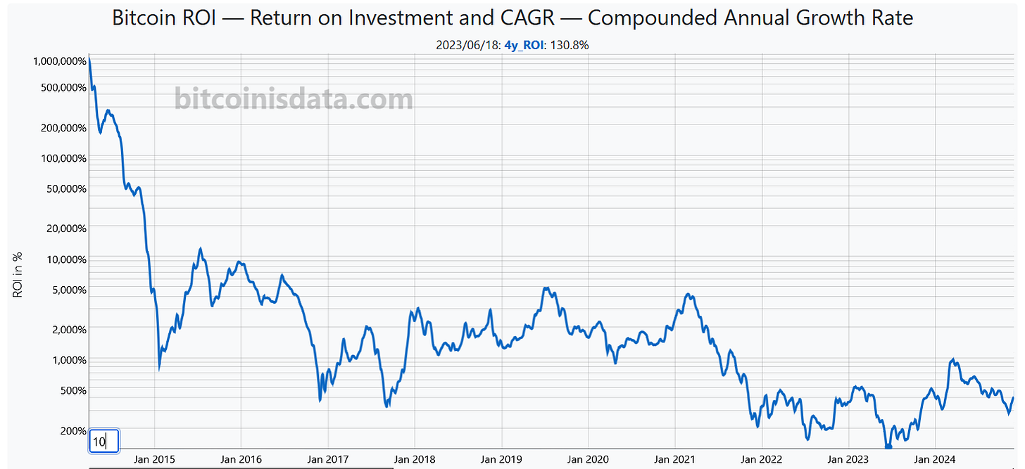
With the recent sharp increase in Bitcoin's price, it's worth taking a look at historical returns. To that end, we've provided a new visualization that encompasses the ROI (Return on Investment—the percentage change in your dollar value over a period of time) and CAGR (Compound Annual Growth Rate—the average percentage change over a specified number of years).
We provide both metrics for the following time periods: 1, 2, 4, 6, 8, 10, and 12 years. You can also toggle between linear and logarithmic scales and display halving dates.
For example, over a four-year period, Bitcoin's returns have never been negative:
Switching to CAGR, we see that the current annual growth rate for a two-year period is approximately 130%:
Another addition to our suite of charts is the Bitcoin vs. Gold Market Cap visualization. While Bitcoin's price has risen significantly, it remains tiny compared to other financial assets. For instance, Bitcoin's market cap is currently only 10% of gold's total value (USD 1.88 trillion vs. USD 18.53 trillion). We expect this gap to close sharply in the coming months.
As always, all this new data is available for download at a block-by-block height, either through our website or via our API, in both .CSV and .XLSX (Microsoft Excel) formats.
If you have suggestions for improvements, ideas for new data, or requests for additional charts, feel free to leave a comment below, contact us at contact@bitcoinisdata.com or via our Twitter and NOSTR handles.
That’s all for today!
We wish a Happy Thanksgiving to all Bitcoiners out there.


