New Charts of the Global Money Supply (M2)!
The evolution of the estimated global M2 is presented in USD, local currencies, and as YoY percent changes.
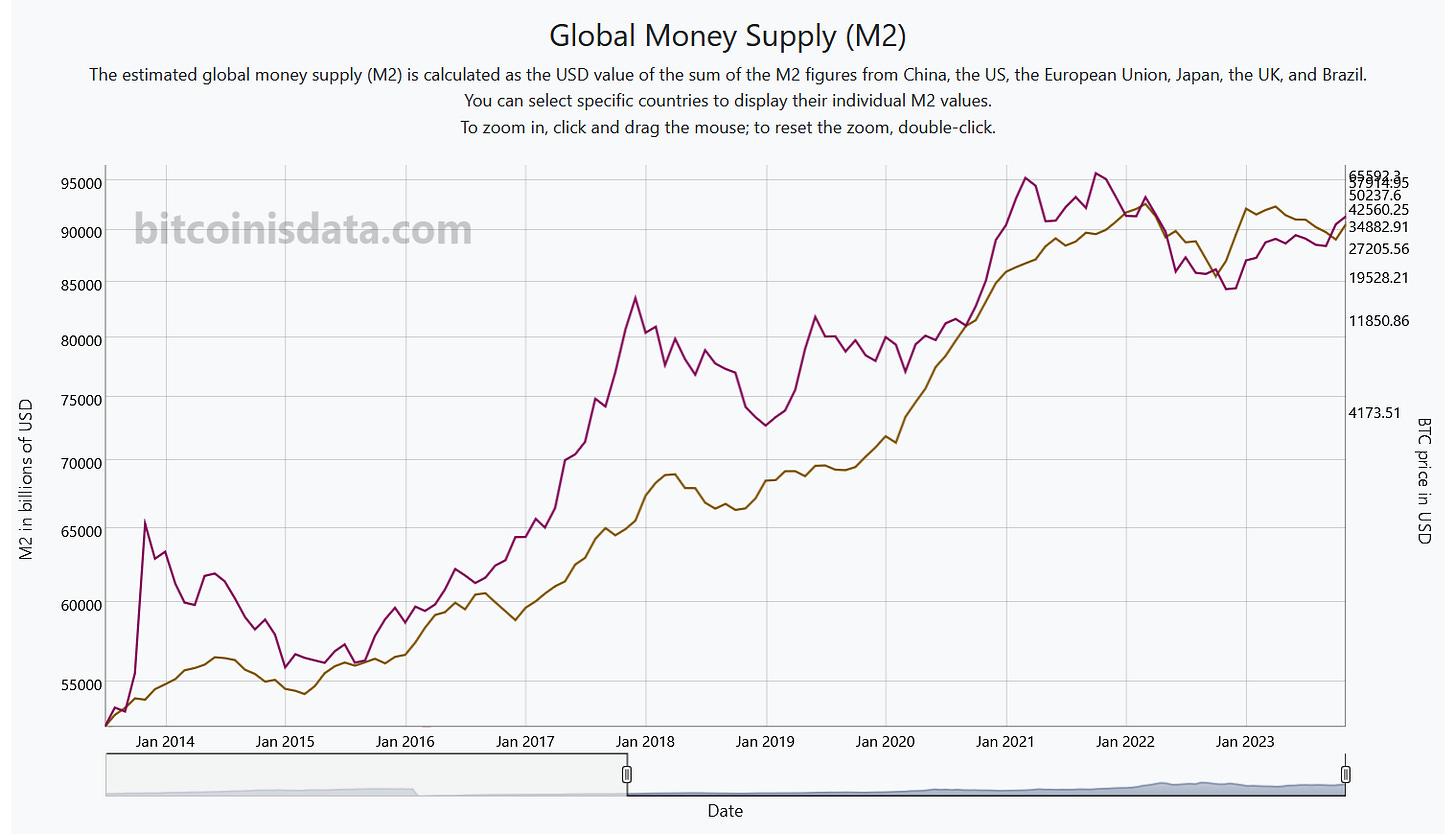
We have been busy over the last few days collecting and cleaning data from several central banks to deliver an estimate of the global money supply (M2). We have finally released it, featuring data from the countries/regions with the largest M2s: China, the US, the European Union, Japan, the UK, and from our home country at Bitcoin Is Data, Brazil.
The global M2 is a sum of individual M2s converted to USD. You can see that the BTC price has a high correlation with it. When the global money supply grows, so does the Bitcoin price, and vice versa.
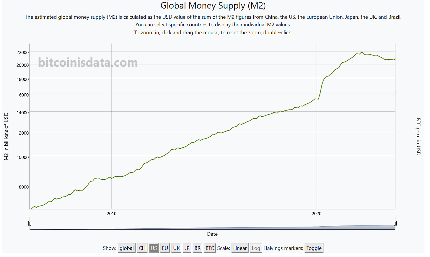
You can choose to display the M2 of individual countries and even hide the BTC price. See below, for example, the M2 of the US. We can clearly see that something significant happened in March 2020. What could it have been? Suddenly, the US M2 experienced a huge surge! This spike in fiat debasement prompted Michael Saylor to search for alternative investment options to prevent the erosion of purchasing power, akin to an ice cube melting. This quest ultimately led him to discover Bitcoin.
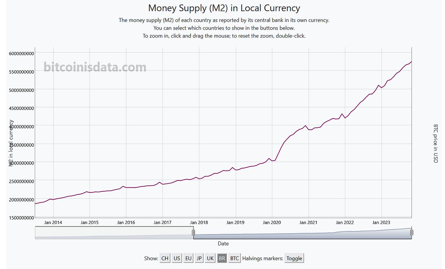
Additionally, we have released a chart to show the M2s of individual countries in their local currencies. You can choose whether to superimpose the BTC price or not. See, for example, the Brazilian M2 in Reais (BRL) below.
Finally, we present a highly interesting chart that displays the year-over-year (YoY) percent change in the global M2 alongside the YoY change in the BTC price. It's clear that they are highly correlated. Additionally, you have the option to display the M2s of individual countries instead of the global one.
That’s all for today. Have a great one!


